What Makes a Visualization Image Complex?
 (opens in new tab)
Venue. TVCG (2026)
Materials.
DOI(opens in new tab)
link(opens in new tab)
PDF(opens in new tab)
supplemental(opens in new tab)
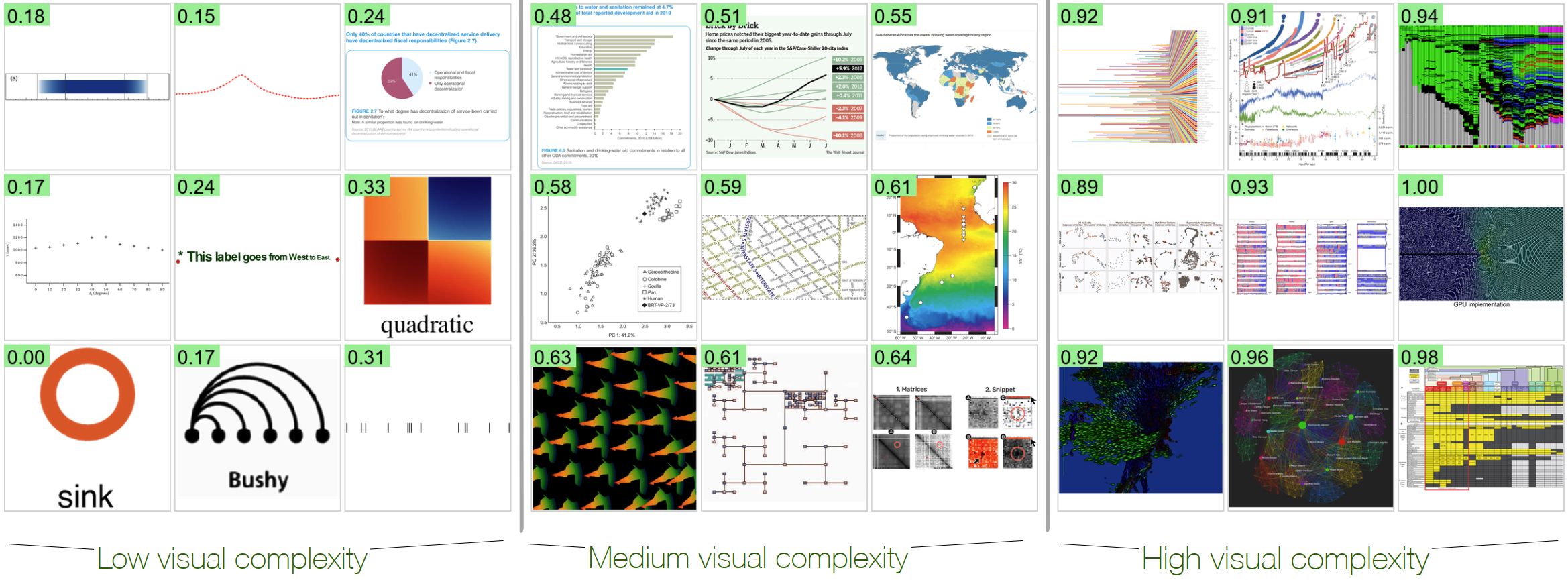
Abstract. We investigate the perceived visual complexity (VC) in data visualizations using objective image-based metrics. We collected VC scores through a large-scale crowdsourcing experiment involving 349 participants and 1,800 visualization images. We then examined how these scores align with 12 image-based metrics spanning pixel-based and statistic-information-theoretic (clutter), color, shape, and our two new object-based metrics (meaningful-color-count (MeC) and text-to-ink ratio (TiR)). Our results show that both low-level edges and high-level elements affect perceived VC in visualization images; the number of corners and distinct colors are robust metrics across visualizations. Second, feature congestion, a statistical information-theoretic metric capturing color and texture patterns, is the strongest predictor of perceived complexity in visualizations rich in the same continuous color/texture stimuli; edge density effectively explains VC in node-link diagrams. Additionally, we observe a bell-curve effect for texts: increasing TiR initially reduces complexity, reaching an optimal point, beyond which further text increases VC. Our quantification model is also interpretable—enabling metric-based explanations—grounded in the VisComplexity2K dataset, bridging computational metrics with human perceptual responses. The preregistration is available at osf.io/5xe8a. osf.io/bdet6 has the dataset and analysis code.
Link to this page: